Innovation inspired by tradition
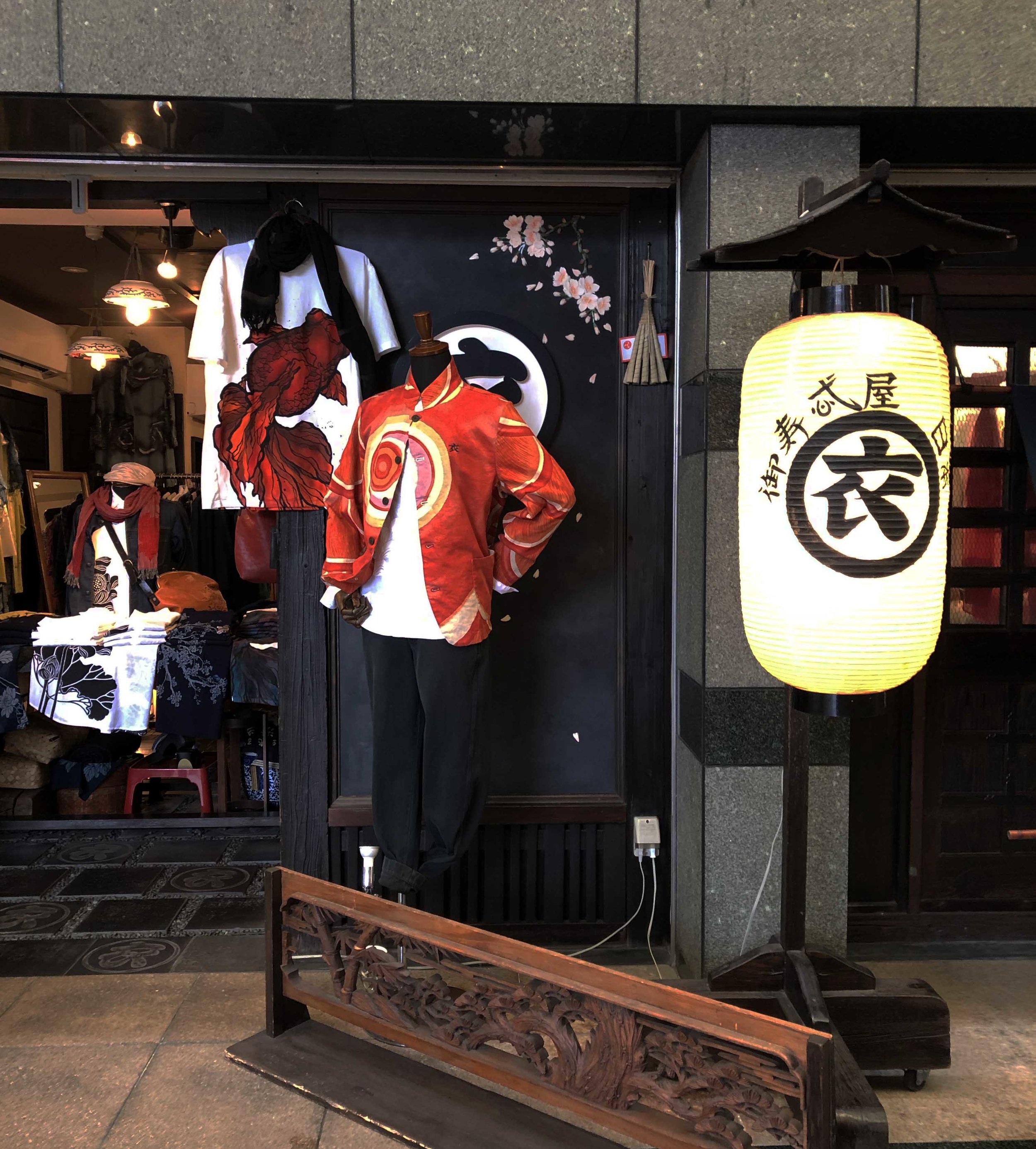
In the world of modern Japanese design there is a trend on experimentation and innovation of materials and technology. But alongside these advancements stands an equal enthusiasm for the preservation of manual traditions and local craftsmanship. There is no conflict between the old and new in Japan: tradition becomes something in which to find inspiration and from which innovation flows.
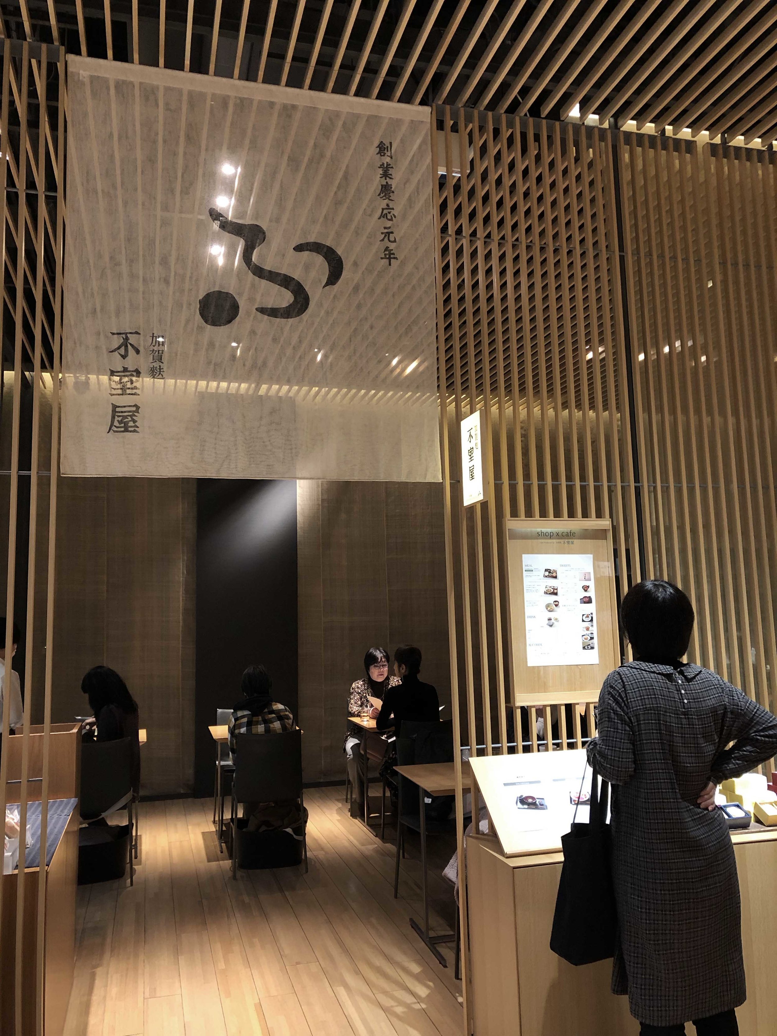
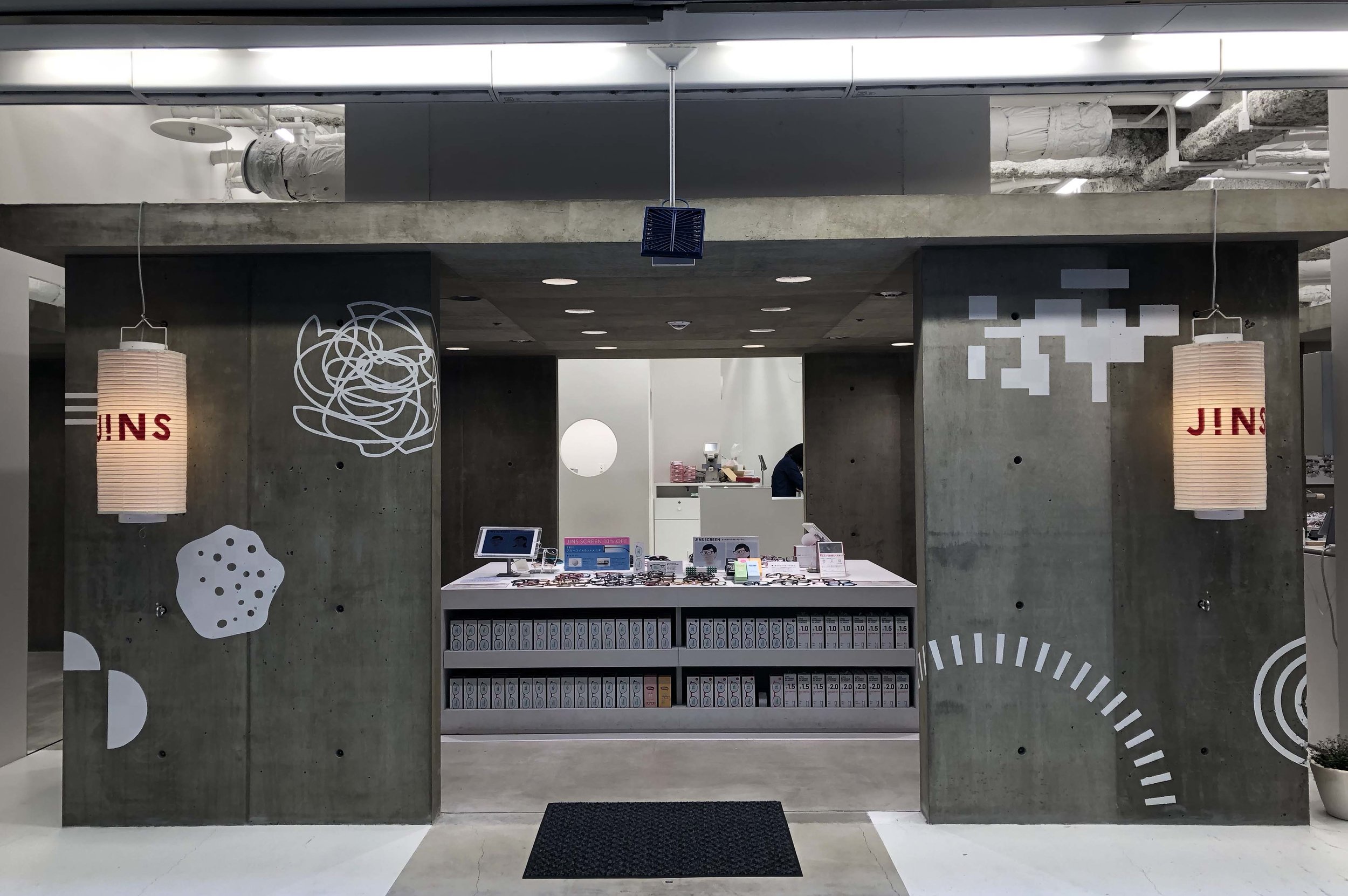
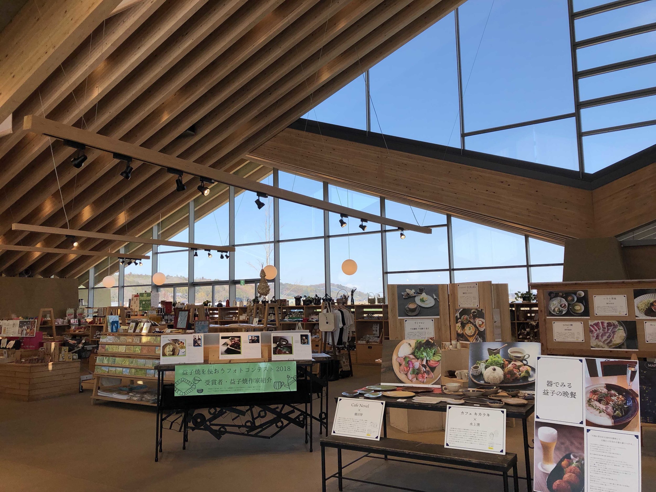
On my recent trip to Japan this notion was set in stone, especially in a city like Tokyo where old and new live in total harmony. From the architecture and interior design of new hotels, stores and restaurants to the graphic design of posters, brochures and menus, a unique simplicity in design remains evident.
So when and how did this iconic minimalist Japanese design aesthetic come about? Japan, much like China, Korea and India, was once a nation where extravagant, highly decorated items symbolizing power were treasured. The fifteenth century saw Japan experience a civil war where over a ten year span Buddhist temples, Buddhist statues, paintings, calligraphy and kimonos were destroyed, resulting in an astounding cultural loss. The shogun of the time, Ashikaga Yoshimasa, was better known for his aesthetic taste than his leadership skills. After growing very wary of the continuing civil unrest, he appointed his son to the throne and retired to the Higashiyama area of Kyoto. Due to a philosophical resignation in reaction to the enormous cultural devastation that was taking place, Yoshimasa gravitated towards the simple and quiet, and cultivated a taste for a refined, austere and rustic aesthetic. He devoted the remainder of his life to these aesthetic endeavours; building his retirement home, the Silver Pavilion, and becoming a major patron of the arts - commissioning talented artists and craftspeople, ultimately putting their work in the limelight. His particular taste was reflected in many of the distinctive artistic developments of the time. Landscape gardening, tea ceremony, ikebana, painting, space design and dance all became popular around this time. Yoshimasa can be thanked for his pivotal role in this emerging appreciation unique to Japan, one of ultimate simplicity.
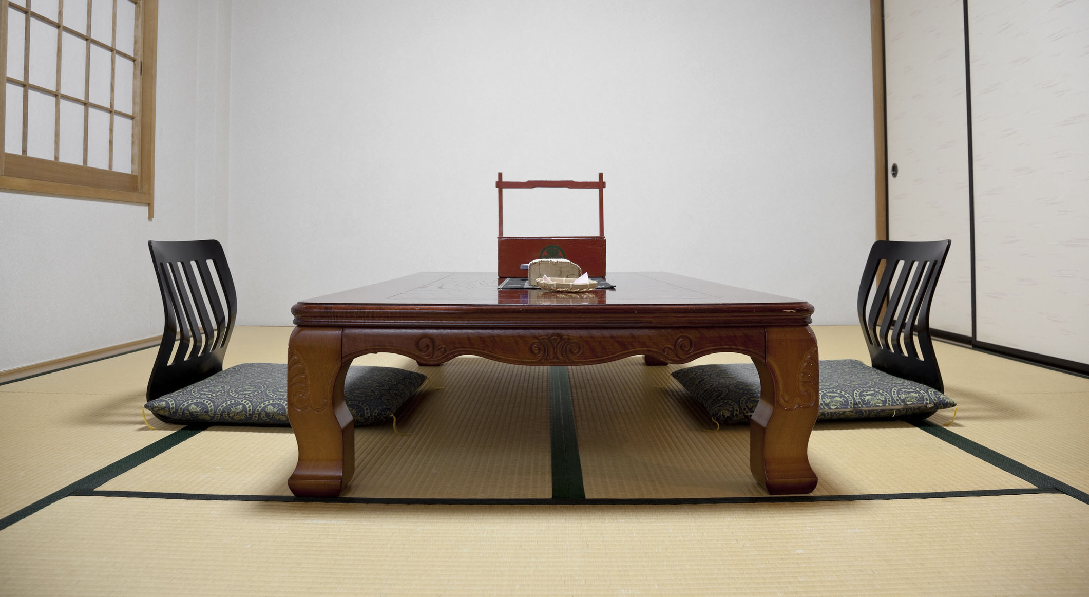
This concept of ultimate simplicity is almost better described as emptiness. A good example of this was Yoshimasa’s study, a space said to be the origin of the traditional Japanese style room. It featured tatami flooring (woven straw mats), shoji doors (translucent paper sliding doors), a simple chodai (writing table) alongside the edge of the room from which the sliding doors behind could open slightly to reveal a garden, in the shape of a hanging scroll. It was during this time that this new aesthetic sense arised, one which recognized the richness of this extremely simple and empty space, precisely because of the empty aspect. Without the excess ornamentation, one was free to experience the space in limitless ways from which endless imagination flows.
Another good example of this ideology used often to help explain this emptiness is the design of the traditional Japanese Yanagiba knife versus a German Henckels knife. The Henckels knife is very well considered ergonomically, designed for ultimate comfort the grip fits perfectly in your hand when you pick it up. Compared to this, the Yanagiba knife is just a stick. But you can hold it anywhere. Both where and how to hold it are up to the chef. This plain handle is receptive to any and all of the chef’s exceptional techniques. A perfect example of emptiness.
In my personal research when thinking of new designs and shapes, I have come across many examples where new designs are inspired by old traditions that encompass this notion of simplicity or emptiness. I love the richness and history this brings to the piece.
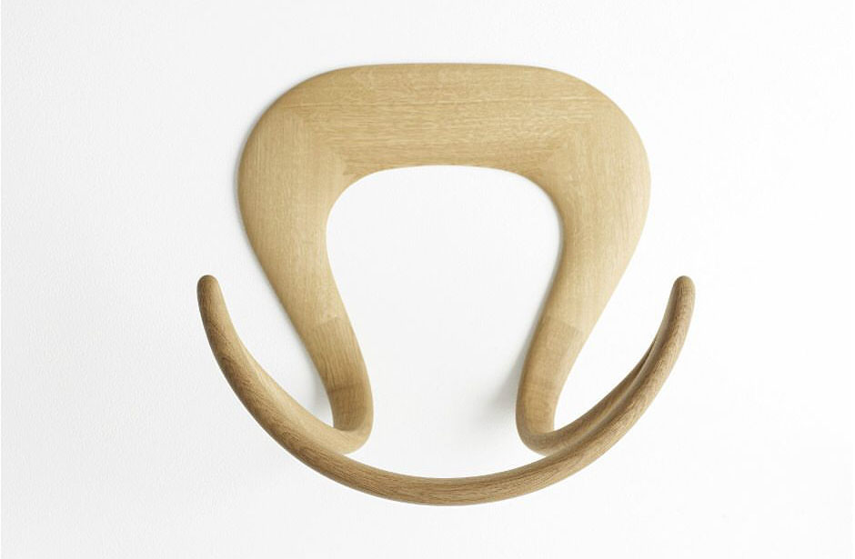
Tatamiza chair
Kenya Hara
2008
In a traditional Japanese room, everyday activities are carried out on the tatami floor and must be easily moved about to reuse the space. During the day there are floor cushions or small, low seats to use during meal times or tea ceremonies. Kenya Hara revisited and gave new life to these chairs with his Tatamiza, made from bent oak, designed to ergonomically support the back in an elegantly simple manner.
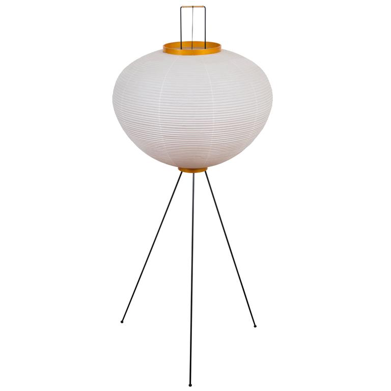
Akari Lamp
Isamu Noguchi
1951
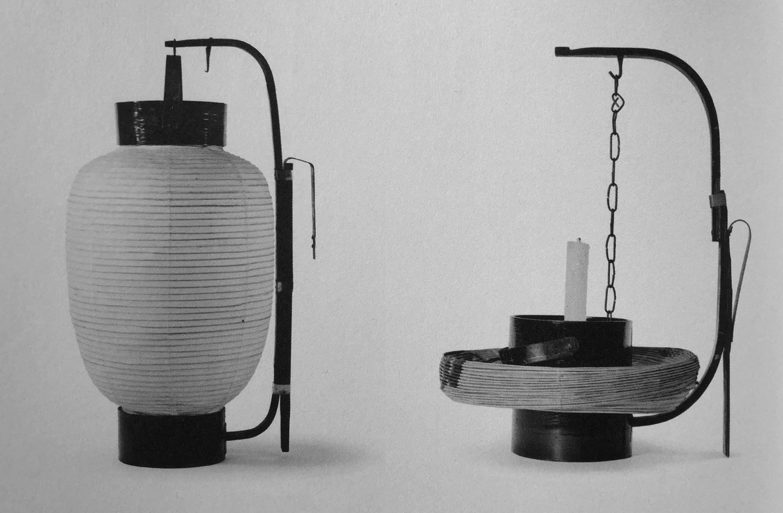
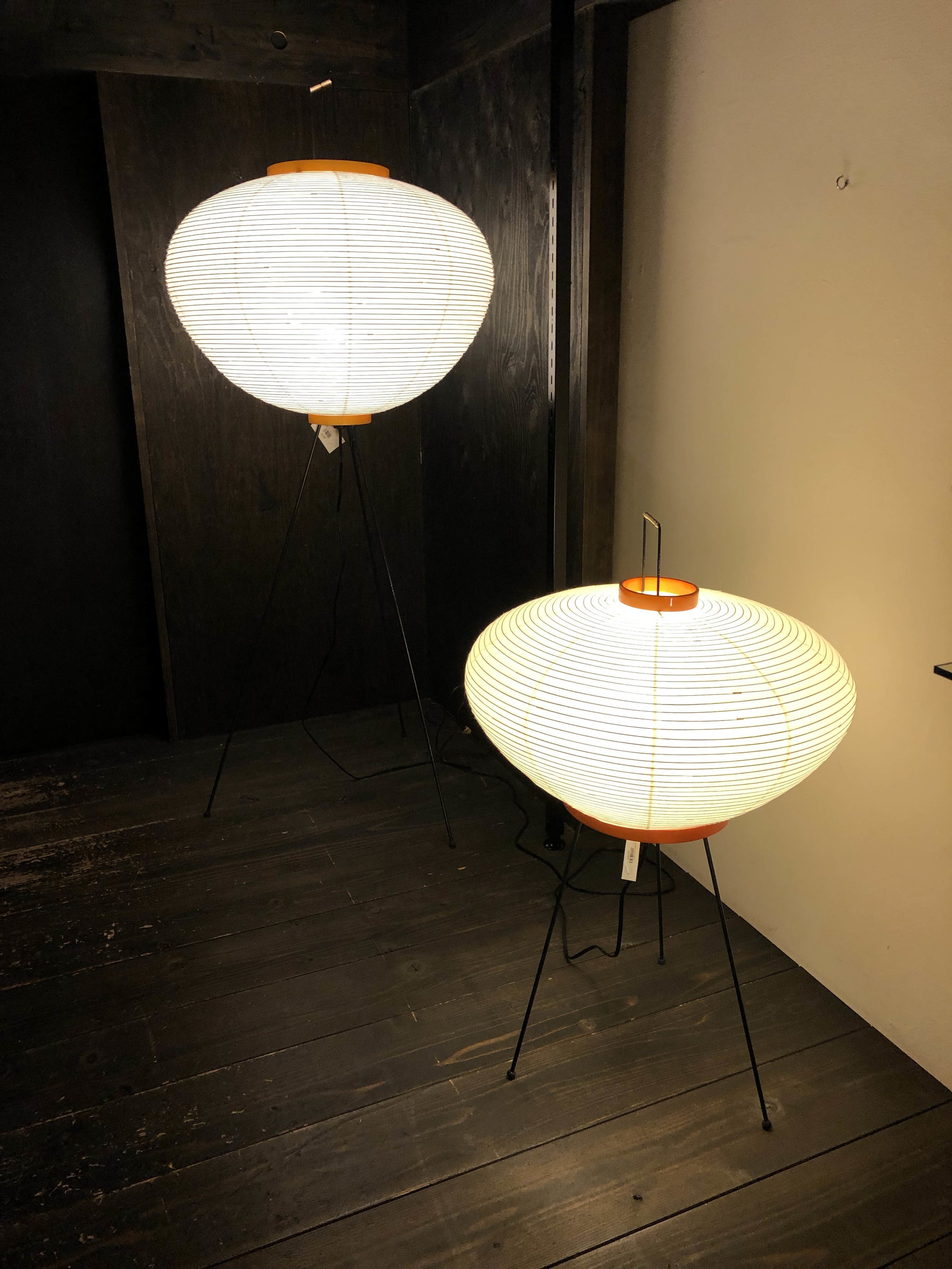
In 1951, well known designer, Isamu Noguchi created the first iconic Akari Lamp. He found inspiration in the ancient paper lanterns used for night fishing in the city of Gifu. Using the same technique of stretching mulberry paper over a bamboo frame, he recreated it into a new contemporary shape and added an iron stand to complete the design.
Kimono forest
Yasumichi Morita
2013
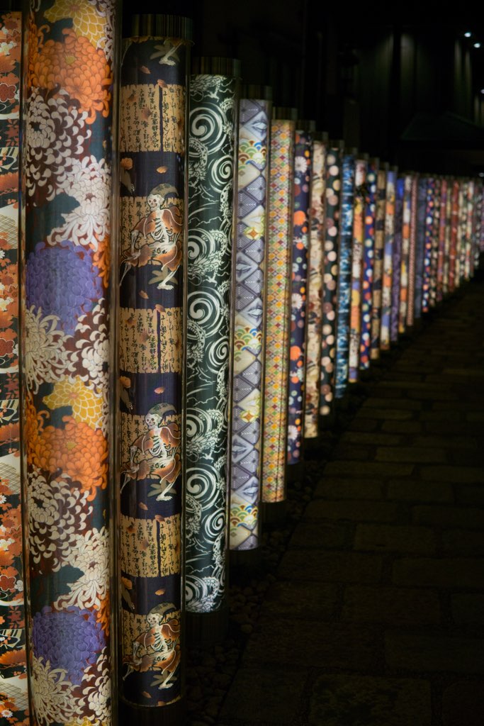
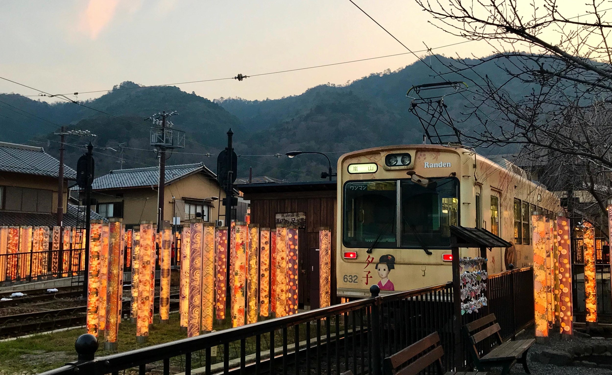
On my recent trip to Japan, I stayed in the beautiful area of Arashiyama in Kyoto. One of its main attractions is its historic bamboo forest. Using this as inspiration, artist, Yasumichi Morita, created a collection of 600 cylinder-shaped pillars framing the lane around the Randen tram station. Inside these acrylic pillars, Morita selected 32 varieties of kimono fabric sourced from Kamedatomi, a long standing textile factory whose history dates back to the Taisho period.
In the evenings, this “forest” really comes to life as the LED filled pillars light up, showcasing the vibrancy of the historical kimono fabrics. Morita’s concept for this installation was to “give a fresh air to the station while still keeping the old tradition”.
Stone Garden
Nendo
2013
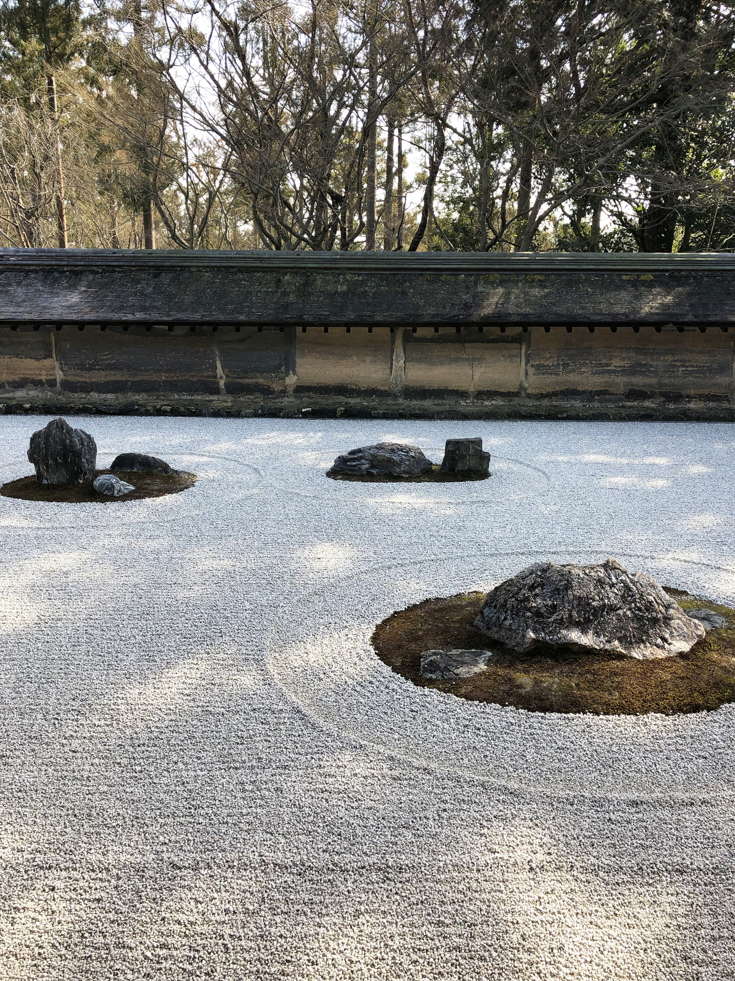
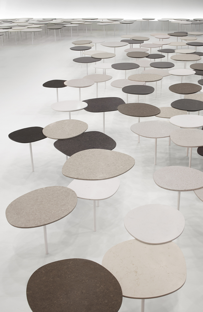
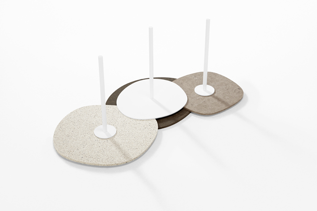
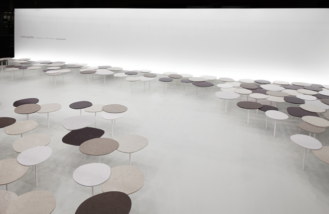
One of my favourite design studios, Nendo, found inspiration in the austere simplicity of Japanese Zen gardens. These gardens, or dry landscapes, feature carefully placed stones and rocks to represent the earth, sky, water, etc and are places of meditation. Here the “rock” notion is transformed into clustered table tops made from Caesarstone, a robust material able to withstand its single centre leg.
2020 Olympics & Paralympics logo
Tokolo Asao
2016
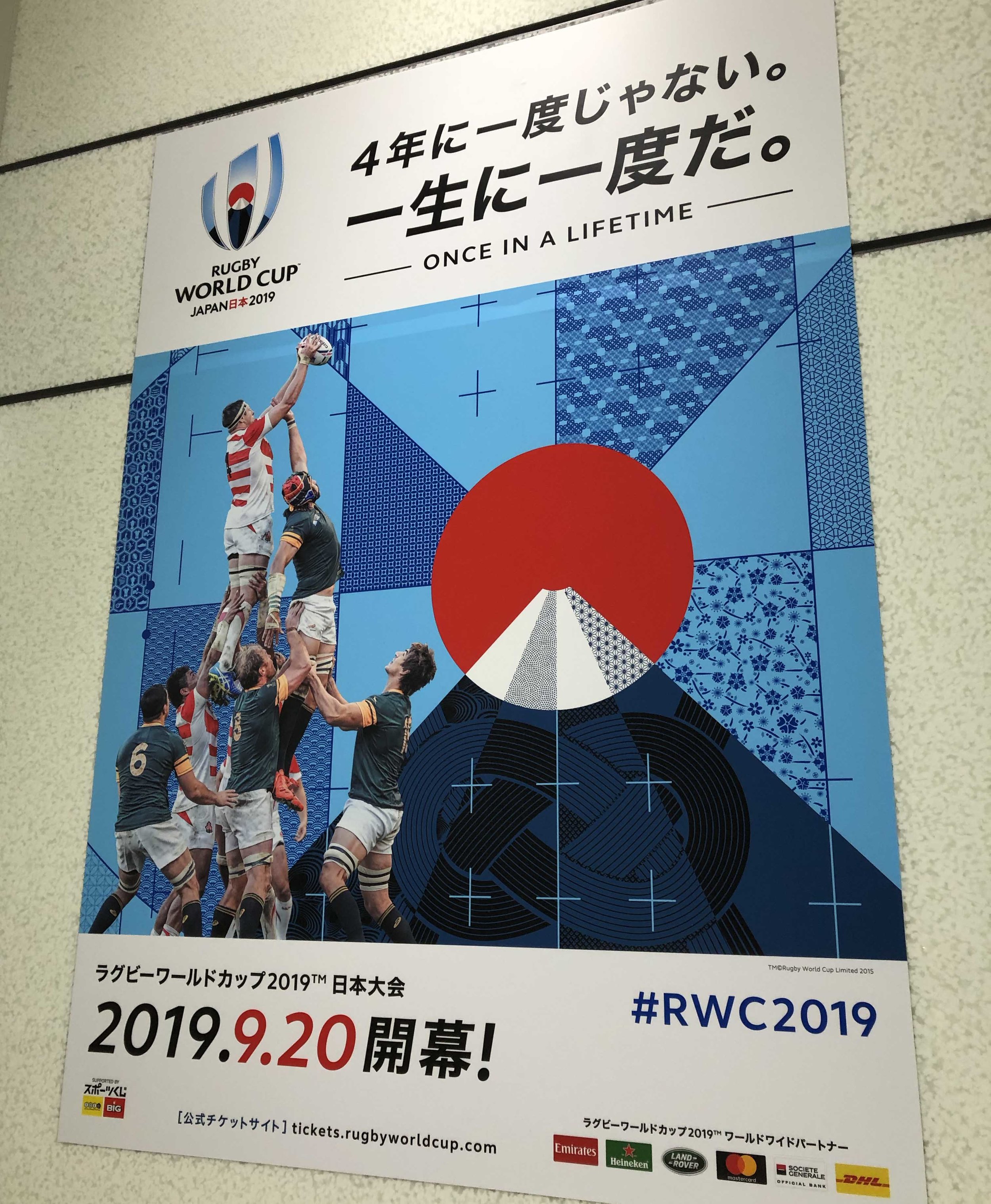
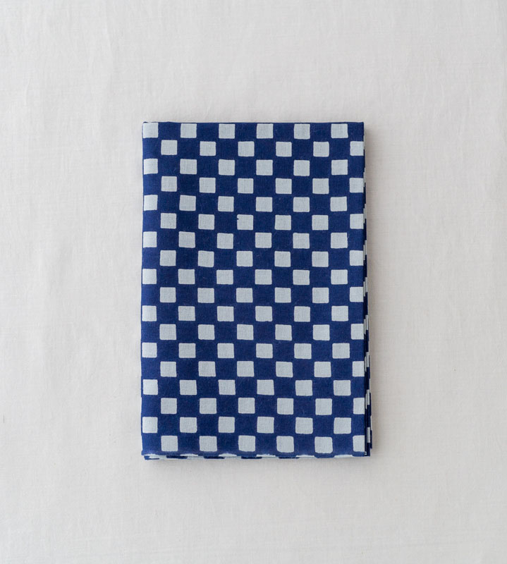
Tokolo Asao has been chosen as the official designer of the Tokyo 2020 Olympics logo. Trained as an architect, he has always been interested in mathematical design. The idea behind the 2020 Olympics logo stemmed from an Edo era kumi ichimatsu pattern: a checkerboard style pattern often made with indigo. Traditional Japanese fabrics used to make kimomo or yukata require their patterns to be able to connect seamlessly. This particular idea of “connection” is a common theme in all of Asao’s recent work, and one that was the driving concept behind the 2020 logo. Using advanced mathematics he redesigned three interlocking itchimatsu patterns to create these seamless, circular, contemporary logos.
References
Rosella Menegazzo & Stefania Piotti, Wa (Phaidon Press Limited, 2014)
https://wiki.samurai-archives.com/index.php?title=Ashikaga_Yoshimasa
https://fr.japantravel.com/kyoto/the-kimono-forest-of-arashiyama/20545
http://www.nendo.jp/en/works/stone-garden/
Ogawa Fumio, Japanese Pattern Design (Edo-Gaku Magazine, No. 19 Spring edition)


